
WIP - RM Printing
Ribblr app redesign
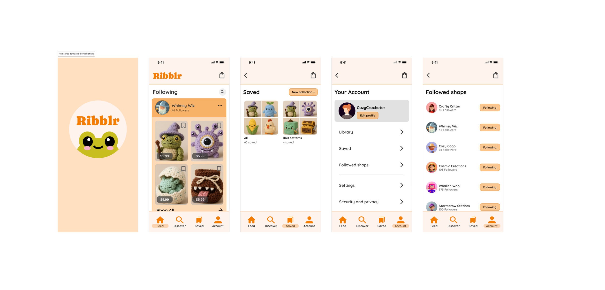
Project: Improving Navigation & Saved Content Experience
Role: UX Designer | Researcher | Wireframer | Prototyper
Tools: Figma, Usability Testing, Wireframes & Prototypes
Problem
Ribblr’s current navigation and Wishlist system causes friction for users:
Saved shops and saved items are combined under one “Wishlist” section, breaking user expectations.
Navigation labels like “My stuff” or “Feed” do not clearly indicate where followed shops or saved items live.
Usability testing revealed confusion around finding followed shops and saved content, leading to unnecessary navigation loops.
This unclear structure lowers user satisfaction, prevents easy access to saved content, and negatively impacts shop engagement.
Opportunity Areas
Simplify Navigation:
Use clearer labels and logical groupings to align with user mental models.Improve Saved Content Discoverability:
Separate saved shops from saved patterns for clarity and ease of access.Streamline User Flows:
Reduce friction when revisiting saved content or managing followed shops.Enhance Visual Feedback:
Use snackbars, button states, and clear hierarchy to guide users.
Research & Usability Findings
Confusing Labels: Users were unsure where to find followed shops due to unclear navigation labels.
Unclear Search Behavior: Multiple users tried using the search icon on the Feed page to find shops, but it didn’t function as expected.
Low Visual Feedback: Users struggled to see if they were following a shop due to poor button visibility and lack of feedback.
Alternative Paths Needed: Participants expected multiple ways to access followed shops and saved content, including from their account page.
Proposed Solutions
Introduce a dedicated “Saved” section separating “Saved Items” and “Followed Shops.”
Simplify the navigation bar using clear, action-oriented labels like “Home,” “Discover,” “Saved,” and “Profile.”
Add search and filtering tools on Discover and Followed Shops pages to help users find shops easily.
Use visual indicators (snackbars, button states) to confirm user actions like following or saving.
Personalize the Home page feed to show products from followed shops, reducing steps to discover new content.
Next Steps
Further Usability Testing: Validate redesigned navigation labels, Saved section flows, and search placement.
Iterative Refinement: Incorporate user feedback to ensure clarity, efficiency, and alignment with user expectations.
Potential Feature Expansion: Explore integrating notifications or recommendations into the Followed Shops experience.